
Before we start discussing details about creating graphs in MS Excel, it is best that we agree on a few terms and concepts. What you will learn to create in this section is an embedded graph or chart. “Embedded” means that the chart appears next to your data in your worksheet. Note that it is also possible to create a chart in a separate, dedicated worksheet. Using embedded charts present the advantage of seeing dynamic changes in your chart happen while you are typing in extra data in your dataset or while you are modifying a dataset.
When you first create a graph, a certain amount of space in your sheet will be allocated to the embedded chart. The chart area is the area that contains the chart/graph, the legend, the titles and so on. Many details may be modified in the chart area such as the position and size of the different titles, the position and size of the chart itself, the background color (if any)…
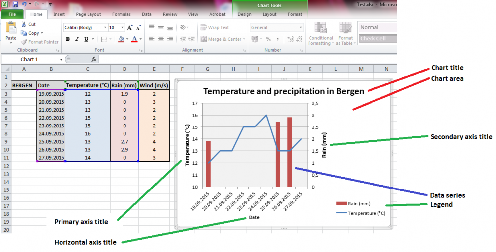
Your graph, located in the so-called plot area, will certainly have a horizontal (X) axis and a vertical (Y) axis. Both of them can have a title. From time to time, you will have two or more datasets or series to display in a common graph. If units and scales are dramatically different, you may want to use a secondary vertical axis, which may also get its own title. Don’t forget the chart title; it often helps a lot in order to quickly understand the meaning of your chart. Finally, when using several data series, the legend becomes necessary.