
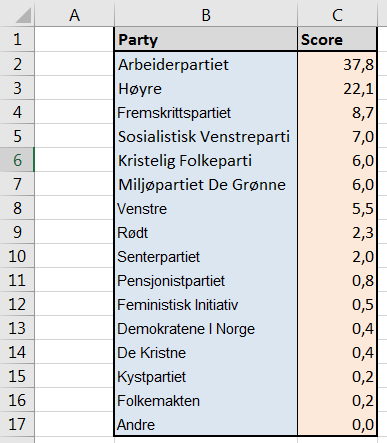
 It is not so often that one gets to use a pie chart… and it is not so often that such a chart is used for the right purpose. Pie charts can be used to represent different categories of a population, polls, data referring on proportions and percentage. Let’s learn how to make pie charts by using a “local” example: the local elections in Bergen in 2015 (Bergen Kommune, Kommunestyrevalg 2015). Here is the list of the represented parties and their final score expressed in %. (Note that those values have been rounded and that the total is actually equal to 99,9%).
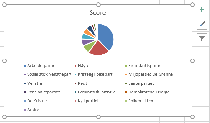 In the same way that line charts were made previously, there is an “easy way” and a “less easy way” to create a pie chart. The “easy way” consists in selecting both columns (labels included, range B1:C17) and clicking on
 Insert Pie or Doughnut Chart in the section Charts of the ribbon under the Insert menu. By selecting the first pie icon that shows up, you will automatically get a colorful pie chart named Score (after the data label found in C1). Note that due to the high number of items, the legend takes a lot of space, thus reducing readability… You may need to tune the chart using options brought up by the icon +. We’ll see this in the next post.
The “less easy way” consists in clicking on the same button without having selected data. An empty chart area shows up, on which you have to right-click to get the contextual menu. Choose Select Data... and the same dialog box (Select Data Source) that you met when entering data for the line chart appears. To the left, click on Add. In the Series Name field, write “Score” or select the cell C1 (the one that contains the name/label of your dataset); in the Series Values field, select the dataset (range C2:C17) and click OK. Back to the Select Data Source box, click on Edit and select the range of cells corresponding to the party names (B2:B17, do not select the label in B1) and click OK. Again, validate with OK. Here as well, the display isn’t optimal. To reorganize the chart, check out the next post.