
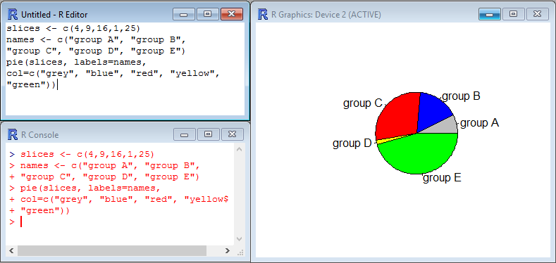
You may use pie charts to visualize the proportions of various groups relative to each other and to a whole population. The function that creates pie chart is called pie(x,y) and mainly need two arguments: x which is a numerical vector which contains the size/proportion of the slices, and y which is a text vector which contains the names/labels of the groups. Of course you may tune the pie with colors, line types…
Let’s take the following example where slices contains the numerical values to display and names the corresponding labels:
[code language=”r”]
slices <- c(4,9,16,1,25)
names <- c("group A", "group B", "group C", "group D", "group E")
pie(slices, labels=names, col=c("grey", "blue", "red", "yellow", "green"))
[/code]
Fant du det du lette etter? Did you find this helpful?
[Average: 0]