We have seen in a different section that boxplots are useful charts which represent several features of a dataset: median, quartiles, minimum and maximum, possible outliers… These boxplots become even more useful when they are placed side-by-side in the same chart, and represent different groups to compare. For instance, when running an ANOVA on multiple groups in a search for possible differences, creating a multiple boxplot would strongly help you visualizing the spread of each of the groups and to the apparent differences between them.
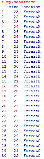
Creating such a chart from a dataframe is rather easy, as you will soon discover. Let’s take an example (used elsewhere in bioST@TS to illustrate one-way ANOVA). In this example, we want to check whether the average size of blue ground beetles (Carabus intricatus) differs depending on their location. We consider 3 different locations, for example 3 forests beautifully named A, B and C. In each location, we measure the size (in millimeters) of 10 individuals. The data are stored in the dataframe called my.dataframe. Here is the code:
[code language=”r”]
size <- c(25,22,28,24,26,24,22,21,23,25,26,30,25,24,21,27,28,23,25,24,20,22,24,23,22,24,20,19,21,22)
location <- as.factor(c(rep("ForestA",10), rep("ForestB",10), rep("ForestC",10)))
my.dataframe <- data.frame(size,location)
my.dataframe
[/code]
and the dataframe looks like this:
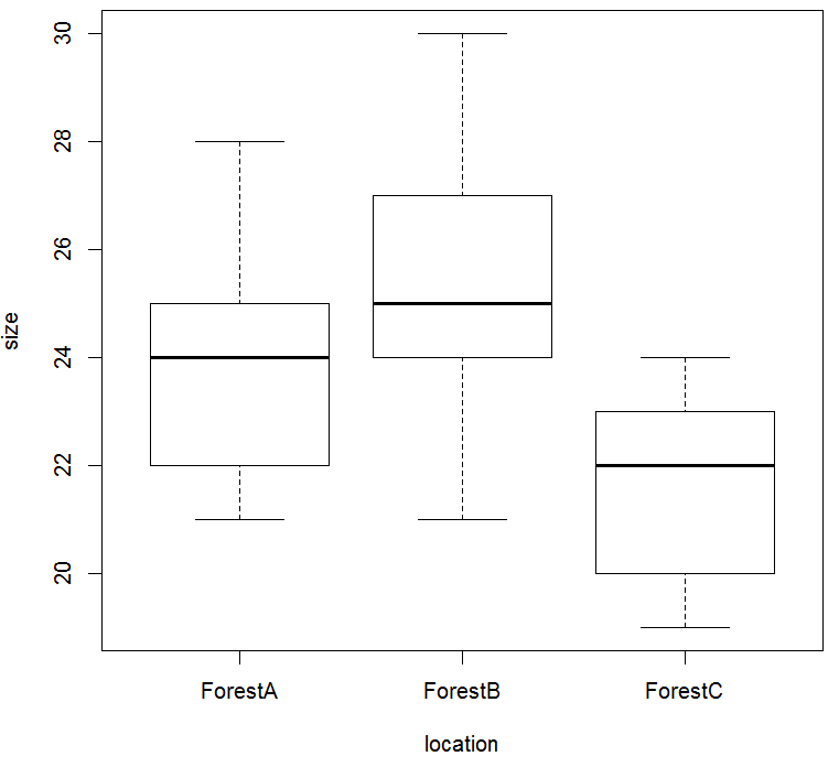
Creating the corresponding boxplots is simply done with the function plot() in which you must indicate which variables must be used, and which one is to be represented as a function of the other one. In our case, we’d like to see size represented on the Y-axis and location on the X-axis; also, it is good practice to indicate with data the name of the dataframe where the entries are stored. Thus the code is:
[code language=”r”]
plot(size~location, data=my.dataframe)
[/code]
and the chart magically appears:
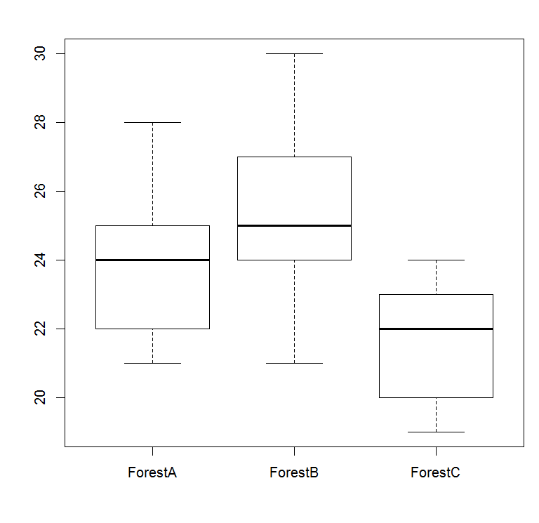
Note that a very similar result may be obtained using the function boxplot() in the same manner:
[code language=”r”]
boxplot(size~location, data=my.dataframe)
[/code]
and the following chart appears, and you quickly realize that the only thing which differs from the previous plot is the absence of title on the axes:
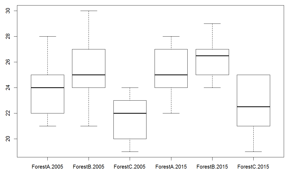
Assuming that you work with a more complex set of data, such as the example in multi-way ANOVA, you may need to take into account the multitude of factors. In a two-way ANOVA, two factors describe the data points. It is still possible to use boxplot() and to create the multiple boxplots, but it is necessary to use a star between the factors in the function. Using the example described in multi-way ANOVA, the codes for the dataframe and the plot are:
[code language=”r”]
size <- c(25,22,28,24,26,24,22,21,23,25,26,30,25,24,21,27,28,23,25,24,20,22,24,23,22,24,20,19,21,22,24,27,26,24,25,27,22,28,25,24,27,29,26,27,25,27,28,24,24,26,21,23,25,20,25,23,25,19,22,21)
location <- as.factor(c(rep("ForestA",10), rep("ForestB",10), rep("ForestC",10), rep("ForestA",10), rep("ForestB",10), rep("ForestC",10)))
year <- as.factor(c(rep("2005",30), rep("2015",30)))
my.new.dataframe <- data.frame(size,location,year)
my.new.dataframe
boxplot(size~location*year, data=my.new.dataframe)
[/code]
And here are the size combinations location*year and the corresponding boxplots that we expected:
Adding extra features to the boxplots:
Boxplots created with the function boxplot() looks pretty much naked… no title, no color… nothing! Let’s see how we can make these charts a bit more attractive.
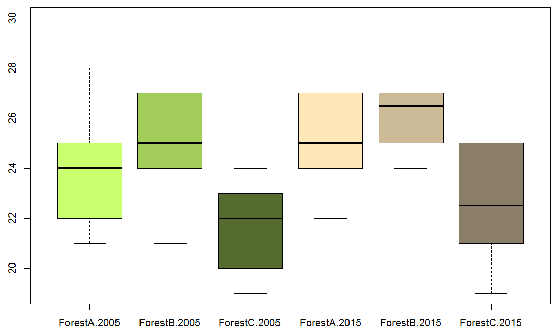
First of all, we can easily add colors to the boxes using the argument col within the function boxplot(). col must be followed by names of colors recognized in R. To use the appropriate codes, refer to this chart. Let’s see the syntax using one of the examples above:
[code language=”r”]
boxplot(size~location*year, col=c("darkolivegreen1", "darkolivegreen3", "darkolivegreen", "wheat1", "wheat3", "wheat4"), data=my.new.dataframe)
[/code]
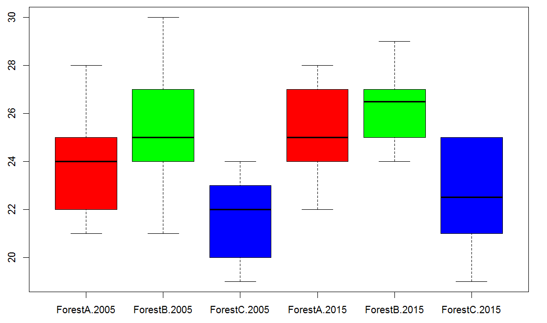
If inspiration is missing when choosing colors, let the function rainbow() do the trick. You must first add require(graphics) to the code, and then you can use rainbow(x) in the argument col. x is just a number that will define the number of colors to be created. Simply replace x by the number of groups that you have, or by the number of levels in one of the factors to get repeated patterns matching the combinations of factors:
[code language=”r”]
require(graphics)
boxplot(size~location*year, col=rainbow(3), data=my.new.dataframe)
[/code]
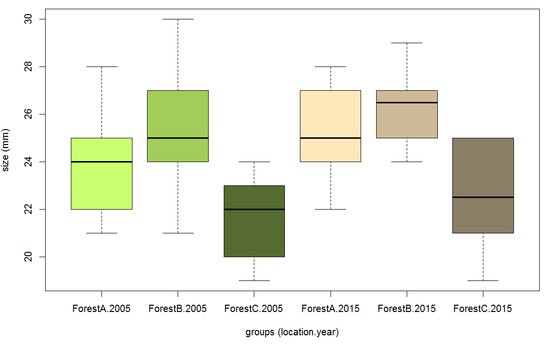
What about putting titles on the x- and y-axis? Adding such features require the use of the arguments xlab and ylab in the following manner:
[code language=”r”]
boxplot(size~location*year, col=c("darkolivegreen1", "darkolivegreen3", "darkolivegreen", "wheat1", "wheat3", "wheat4"), xlab="groups (location.year)", ylab="size (mm)", data=my.new.dataframe)
[/code]
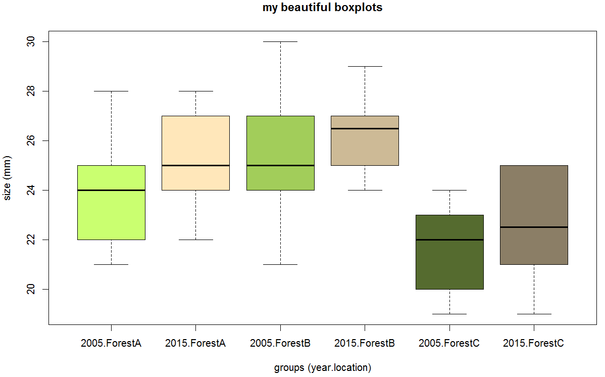
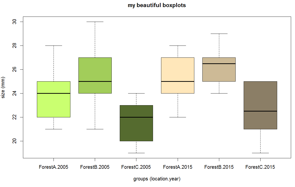
What about adding a main title to the chart? Use the argument main in the following manner:
[code language=”r”]
boxplot(size~location*year, main="my beautiful boxplots", col=c("darkolivegreen1", "darkolivegreen3", "darkolivegreen", "wheat1", "wheat3", "wheat4"), xlab="groups (location.year)", ylab="size (mm)", data=my.new.dataframe)
[/code]
What about changing the order in which the group appears? In the example above, the groups are automatically sorted by location and year, thus grouping the three groups from 2005 first, and then the three groups from 2015. If you wish to arrange them so that the two groups from ForestA are displayed first, the ForestB and finally ForestC, simply write year*location instead of location*year in the function boxplot(). Additionally you might need to tune the colors according to the new sequence:
[code language=”r”]
boxplot(size~year*location, main="my beautiful boxplots", col=c("darkolivegreen1", "wheat1", "darkolivegreen3", "wheat3", "darkolivegreen", "wheat4"), xlab="groups (year.location)", ylab="size (mm)", data=my.new.dataframe)
[/code]