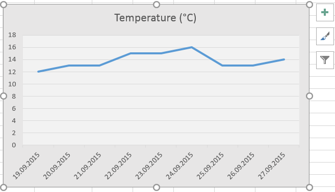
 Now that the graph has been created, you might want to personalize its appearance by adding titles, changing colors, putting a background, and so on. Let’s start by adding colors to the background of the chart area and of the plot area. First, colors: right-click on the chart area, preferably at a place which is not occupied by the graph or the legend. Select
 Format Chart Area.... If it is not already there, a menu appears to the right of the screen. Apply all the changes you find useful (in our case, select Fill, choose the option solid fill and select the color of your choice). Let’s do the same for the plot area: right-click on the plot area, click on Format Plot Area... and apply the modifications of your choice. Note that the possibilities are endless: various colors, gradient fill, background pictures… You may want to experiment a bit… but keep things simple so that the “decorations” do not mask your data or become a distraction to the reader.
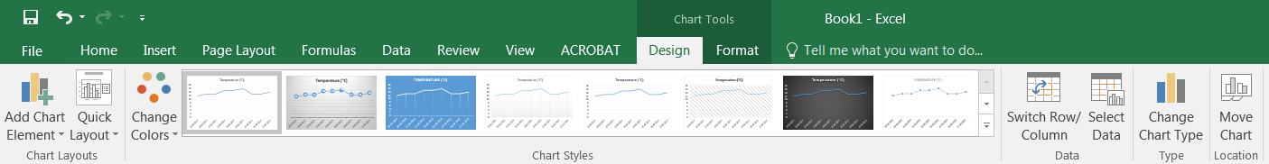
Time to make things a bit more professional with chart title, axis titles, legend and labels. First select the chart area by click on it. When doing so, a new toolbar called Chart Tools appears at the top of the screen and gives access to two new tabs: Design and Format.
The Design tab (see below) provides tools to change chart type (in the section Type, we’ll see that later), switch rows and columns or select data to add new data series… The section Chart Styles offers a series of predefined layouts, some of which directly add titles and legend or labels. You’re then free to modify the corresponding titles and texts by clicking twice on them and replacing the text.
 The icon
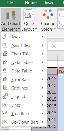
 Add Chart Element in the section Chart Layouts (see picture to the right) is much more useful and interesting. This is where you will find a way to modify virtually all the items that make the layout and design of your chart: axes, titles, labels, gridlines, error bars… From there, you will find basic option for each category as well as a More ... options... which allows you to custom design these items. Again, the possibilities are endless, but don’t start modifying each of these; your data and graph still have to look decent and simple.
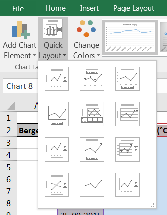 The icon
 Quick Layout in the section Chart Layouts (see picture to the right) is a rather straight forward tool which allows you to quickly define the design of your chart based on a series of predefined designs: just the chart, chart and legends, chart and legends and titles… This option does not affect the data series or the color sets. Using the mouse over the different possibilities also brings a preview of your chart. This comes handy as you might not need more than a minute to test 10 different versions of your chart and find the one that suits best.
The Format tab shown below gives access to a series of tools which will make your graph and texts much more colorful or “artistic”. Options such as those found in Shape Styles and WordArt Styles help you to work on colors, font, text, shapes, shadows and 3D-effects. To the left, the section Current Selection allows you to choose items to be modified from a list of all available items currently included in your chart. Once the item selected, click on Format Selection to find new options, or use the other sections of the ribbon (to the right) to adapt the look of your chart to your wildest wishes.