
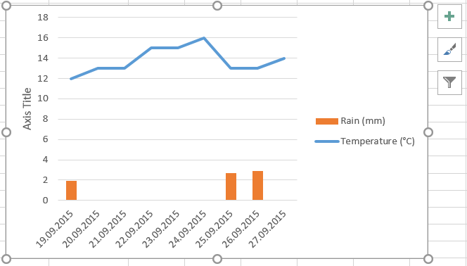
 In the example that we have just built here, we want to keep the data series which represents temperatures as a line chart and show the rain data as vertical bars (see picture to the right). First we need to select the data series “rain” and call the option to change chart type. Many ways are possible: either you right-click in the line representing the rain values in the plot chart and choose
 Change Series Chart Type..., or you go the the section Current Selection in the ribbon of the Chart Tools menu (Format tab) and then go to the section Type of the Design tab to eventually choose the icon Change Chart Type.
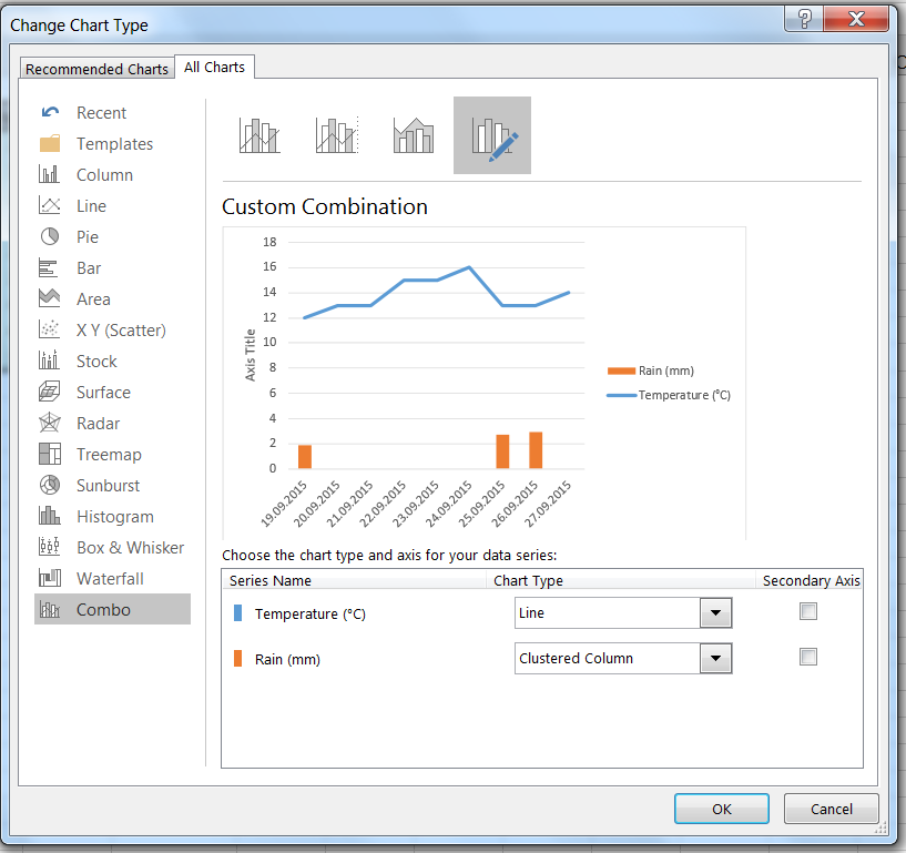 In both cases, you get the dialog box represented in the picture to the right. Simply choose the style you like best, for instance the category
 Combo (to the left) to combined lines and bars in a graph, and then change the chart type for the series name Rain(mm) down to the right to clustered column (note that the bars are automatically resized to fit best the height of the chart).
Once that you have validated by clicking OK, you get the following double chart where temperatures are still represented by a line, but the rain values are now solid bars.
In the next step, we’ll reorganize the chart so that the precipitation values get their own Y-axis to the right (secondary axis) but you see already in this dialog box that it is just about tick the box next to Rain (mm) and clustered column before validating with OK.