Unsurprisingly, the function that adds a title to your plot is called… title(). This function can be “decorated” with several arguments to set the different titles or labels of the chart. Among these are main="text", sub="text", ylab="text", xlab="text", which purposes are to display the main title, a subtitle (secondary title), the Y-axis title and the X-axis title, respectively. Note that these arguments can be used directly in the plot() functions as well as in others charts (see Adding labels via xlab and ylab). Here is an example:
[code language=”r”]
plot(y~x, col="red")
title(main="Main Title",
sub="Subtitle",
xlab="Title for X-axis",
ylab="Title for Y-axis",
)
[/code]
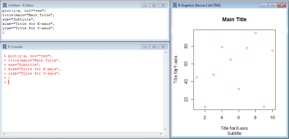
If you are careful or picky, you might comment on the fact that the titles for the axes overlap an x and a y. This is because the function plot() has been entered first and has placed the default labels x and y. When title() was entered, the new labels were simply added on top, as independent items. To avoid that, you may either use xlab="" and ylab="" directly in plot() to force it to write blank/empty labels instead of the default x and y, or use xlab="Title for X-axis" and ylab="Title for Y-axis" directly in the function plot() and nothing in the function title().
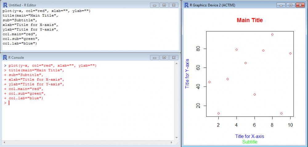
Colors and sizes of the titles and labels can also be tuned via the argument col. Use col.main="", col.sub="", col.lab="" for changing colors of the main title, subtitle and labels, respectively.
[code language=”r”]
plot(y~x, col="red", xlab="", ylab="")
title(main="Main Title",
sub="Subtitle",
xlab="Title for X-axis",
ylab="Title for Y-axis",
col.main="red",
col.sub="green",
col.lab="blue")
[/code]