
 The pie chart that you’ve created previously and modified until now still looks a bit “naked” as there is no display of numerical data or scale. If you want to add the actual values from the dataset on top of the corresponding slices, select the pie by clicking on it, then right-click and choose
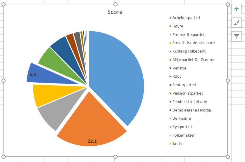
 Add Data Labels. All values are now displayed. Note that it is actually possible to restrict the display of values to only the slices that you want. Instead of clicking and activating the whole pie, click and activate only the slice(s) of interest. Then, right-click and choose Add Data Label. Repeat the procedure with more slices if you wish (see picture to the right).
 Note that the labels are fully tunable. Yo may use the
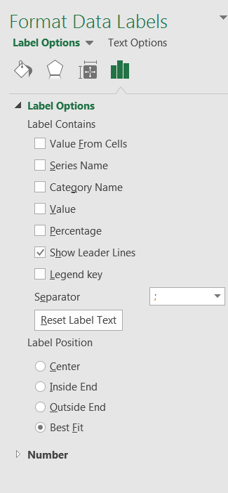
 Font section in the ribbon under the Home tab to modify the font type, size, color and all details that usually apply to text. Additionally, if you right-click on the labels of the pie chart, the contextual menu gives you the option Format Data Label. This opens a panel to the right of the screen which allows you to add/remove the series name, category name, value, percentage… to/from the label. You may as well tune the position of the label, the number formatting, the colors and much more. Note also that the Percentage option may be very useful if your dataset is not made of the actual percentage value that the slices represent: this option makes a calculation based on the ratio between the data value and the sum of all data in the series, then multiplies it by 100. In other terms, if you had had the actual number of votes for each party, Excel would have calculated and displayed the final percentage…