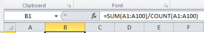
Excel -2- Descriptive statistics

Let’s see how to quickly analyse a simple dataset and define basic values like average, variance, standard deviation, standard error of the mean, and so on.

Warning: this page refers to formulas and functions which exist in the English-based version of MS Excel 2010. If you work on the Norwegian-based version (or any other language), you will have to search for the corresponding “translated functions”. For instance, =AVERAGE() corresponds to the Norwegian-based function =GJENNOMSNITT(). Unfortunately, not all the functions in Norwegian are a direct translation of the English-based functions… You may click here to access a list of functions in MS Excel. To obtain them in the language of your choice, simply scroll down to the bottom of the page, click the Change Language button in the left corner and choose the language of your MS Excel.

Here we will use a simple dataset which you may download here. Along with the dataset, you will find two tables. The first one lists most of the formulas used in this page and already formatted to fit the dataset. The second one is the table of descriptive statistics provided by the Analysis Toolpak (described further below). Also you will find some of the calculations necessary for drawing charts as well as the charts.


var.p
To calculate the variance of a series,  you may choose between using the =VAR.P(...) and =VAR.S(...) functions. Both functions provide the variance, but based on different assumptions and therefore on slightly different formulas.   Use =VAR.P(...) if the dataset that you analyse is a whole population.     Use =VAR.S(...) […]

3. Calculate the variance


standard deviation S
The standard deviation may be calculated using one of the following options: a) the standard deviation is actually the square root of the variance. In MS Excel, this can be written =SQRT(VAR(...)). In our case, type =SQRT(VAR(A1:A100)).   b) use the formula =STDEV.S(...) or =STDEV.P(...) to get the standard deviation of the […]

4. Calculate the standard deviation


cumulative
Often, the simplest way to visualize your dataset or sample will be through a histogram, also called frequency histogram. The histogram will eventually represent the distribution of the data and the shape of the chart will most certainly give you information on whether this distribution is symetrical, bimodal, skewed… This […]

8. How to draw a histogram


homemade boxplot
A boxplot (box plot, or whisker plot) is a compact, but efficient way to represent a dataset using descriptive stats. This “little diagram” combines informative, standard values such as the first and third quartiles (the bottom and top of the box, respectively), the median (the flat line inside the box) […]

9. How to draw a boxplot