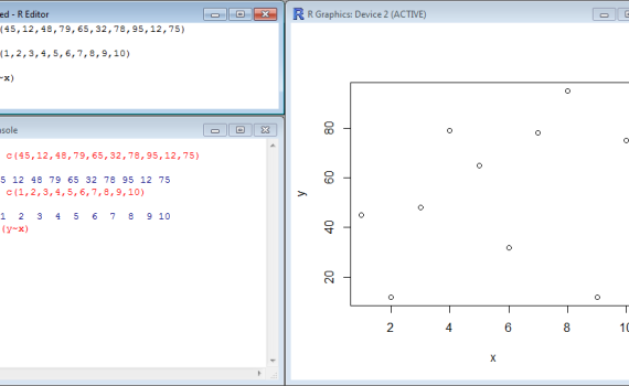
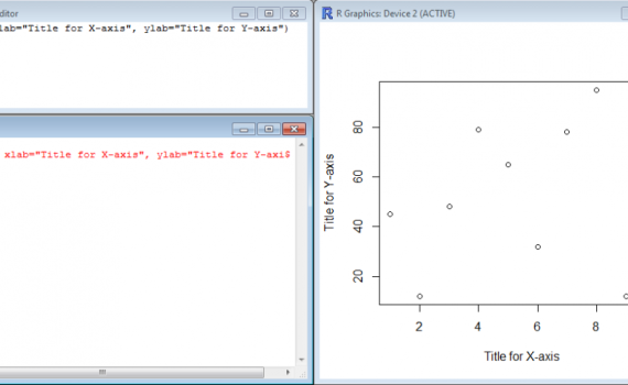
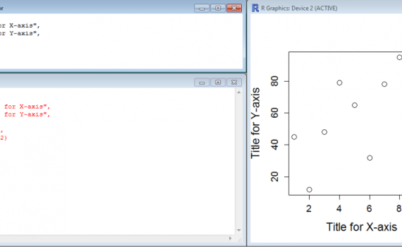
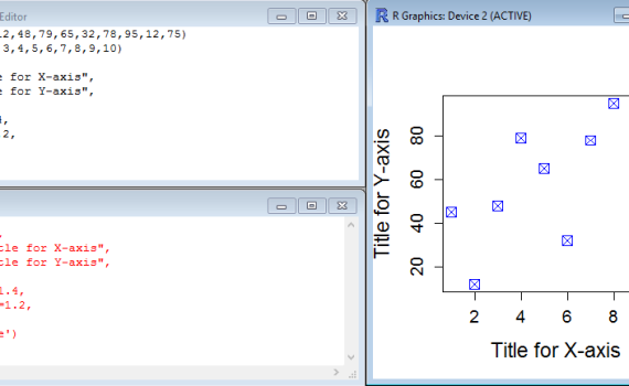
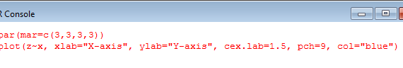
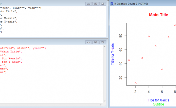
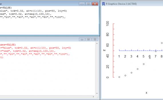
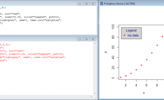
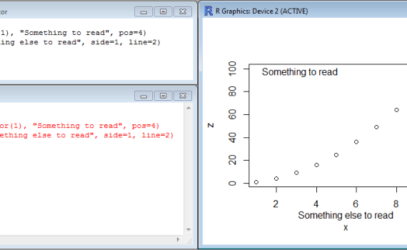
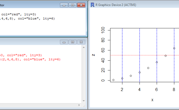
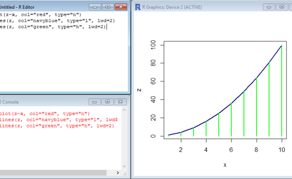
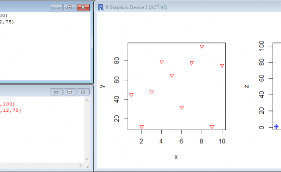
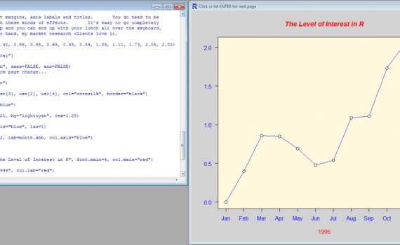
R -7- Making plots – Learn the basics

It is time to start drawing charts and visualize your data in a more graphical manner. As you will see in the next section, R is really powerful and give you the chance to do what you want, providing that you know the language. They are plenty of functions and arguments to set up all kind of items. However, before getting fancy and making impressive charts, it is necessary to get the basics.


plot
Let’s start easy and create a simple plot of a dataset. The dataset consists of 10 values ranging from 12 to 95 which are stored in the vector y while the vector x contains the series 1:10 that will be used as the X-axis. Here we use the function plot() in […]

2. Starting with a plot


labels
The command plot() may contain several lines of code to tune the display and make the plot more “readable”. For instance, it may be useful to add labels to the Y-axis and X-axis. The arguments to be used are xlab= and ylab= as shown here: [code language=”r”] plot(y~x, xlab="Title for X-axis", […]

3. Adding labels with xlab and ylab


pch col
The default symbol for plotting data elements is an open circle, but you are not obliged to stick to this. The argument pch= (plotting character) allows you to choose the symbol from a list. Check in the list below which symbol you like best and indicate the corresponding number in the […]

5. Modifying symbols


par mar order
When you start playing with the size of the labels and titles, you quickly realize that the frame of the plot becomes too small. It is time to introduce the argument par(mar=c(B,L,T,R)) where B, L, T and R stand for bottom, left, top and right, respectively. Of course you will […]

6. Adjusting margins


coloured titles
Unsurprisingly, the function that adds a title to your plot is called… title(). This function can be “decorated” with several arguments to set the different titles or labels of the chart. Among these are main="text", sub="text", ylab="text", xlab="text", which purposes are to display the main title, a subtitle (secondary title), […]

7. Adding titles and labels


tuning axes
Not only can the text/labels of the axes be tuned, but also the lines, colors, annotations, ticks… The function axis() may be used with various parameters such as col (for the colors), tck (for the length of the ticks), at (for using a vector to indicate the position of the […]

8. Tuning axes


legend
The function legend() is all you need to set up the legend in your chart. It can contain a lot of arguments due to the amount of details such a field may require… The essential arguments are location, title, bg (for background color), cex (for size), text.col (for text color…), legend […]

9. Adding legends


annotations
Two functions are available to add text or notes to your chart: text() and mtext(). Use text() if the text must appear in the graph area, but use mtext() if the text is to be placed in one of the margins. The arguments are location, pos (for the position relative to location), side […]

10. Adding text annotations


abline
Reference lines are useful to visualize a threshold on a chart, or to represent or point at specific values such as mean and median. The function abline( ) draws such a line directly in your chart. abline() needs to know whether the line is horizontal (h=) or vertical (v=) and […]

11. Adding reference lines


clipboard
Once you’ve done your magic, you may be interested in keeping a memory of your masterpiece. This is where the Save as menu becomes useful. Note that the graphic window (the one containing your graph) must be active when saving; if you aren’t sure about it, click once on the […]

13. Saving a graph


combining graphs
A simple function allows you to display multiple charts side-by-side. It can be charts of the same type or of many different sorts; it can be just plots next to each other (lines) or many plots aligned in rows and columns (matrices). That function is called par(mfrow=c(X,Y)) where X is […]

14. Combining graphs